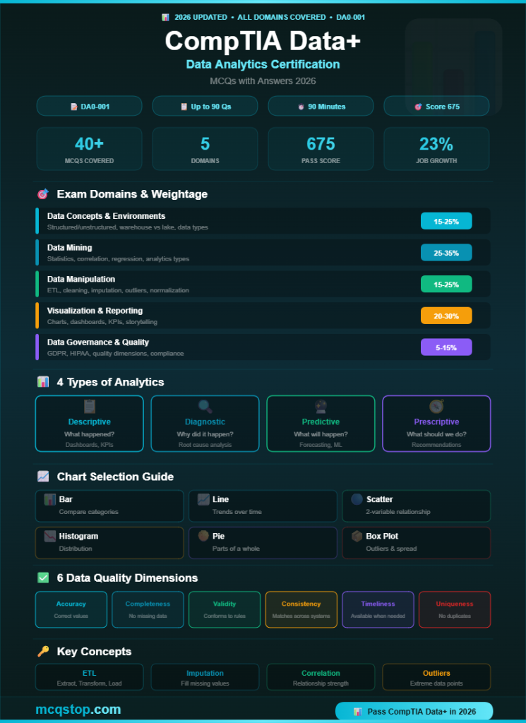
Data Concepts & Environments
Domain 1 — 15-25% of Exam
Question 01
Which type of data is organized into rows and columns with a predefined schema, typically stored in relational databases?
AStructured data ✅
BUnstructured data
CSemi-structured data
DQualitative data
💡 Explanation: Structured data follows a rigid, predefined schema with rows and columns — like SQL databases, spreadsheets, and CSV files. Unstructured data has no predefined format (images, videos, emails, social media posts). Semi-structured data has some organization but no rigid schema (JSON, XML, logs). This three-type classification is one of the most tested Data+ concepts.
Question 02
A company uses a centralized repository that collects data from multiple sources, transforms it, and stores it for reporting and analytics. What is this called?
AData warehouse ✅
BData lake
CData mart
DData pipeline
💡 Explanation: A data warehouse is a centralized repository of structured, transformed data optimized for reporting and analytics. It uses ETL (Extract, Transform, Load) to clean and organize data from multiple sources. A data lake stores raw data in any format (structured + unstructured) without transformation. A data mart is a subset of a warehouse focused on one department. A data pipeline is the automated flow of data between systems.
Question 03
Which data type represents categories or labels without a natural numerical order?
ANominal ✅
BOrdinal
CInterval
DRatio
💡 Explanation: Nominal data represents categories with no inherent order — like colors (red, blue), gender (male, female), or country names. Ordinal has a meaningful order but no consistent interval (satisfaction: low, medium, high). Interval has equal spacing but no true zero (temperature in °C). Ratio has equal spacing AND a true zero (weight, height, income). Memorize all four measurement levels for Data+.
2
Data Mining
Domain 2 — 25-35% of Exam (Highest Weight!)
Question 04
Which statistical measure represents the value that appears MOST frequently in a dataset?
AMean
BMedian
CMode ✅
DStandard deviation
💡 Explanation: Mode = most frequent value. Mean = average (sum/count). Median = middle value when sorted. Standard deviation measures how spread out values are from the mean. These are measures of central tendency (mean, median, mode) and measures of dispersion (range, variance, standard deviation). A dataset can have no mode, one mode, or multiple modes (bimodal, multimodal).
Question 05
A data analyst wants to measure the strength and direction of the linear relationship between two numeric variables. Which statistical technique should they use?
ACorrelation analysis ✅
BRegression analysis
CChi-square test
DT-test
💡 Explanation: Correlation measures the strength and direction of a linear relationship between two variables using the correlation coefficient (r). Values range from -1 (perfect negative) to +1 (perfect positive). r=0 means no linear relationship. Important: correlation does NOT imply causation. Regression predicts one variable from another. Chi-square tests relationships between categorical variables. T-test compares means between groups.
Question 06
Which type of analysis answers the question “What is likely to happen in the future?” based on historical data patterns?
ADescriptive analysis
BDiagnostic analysis
CPredictive analysis ✅
DPrescriptive analysis
💡 Explanation: The four types of analytics: Descriptive = “What happened?” (summaries, dashboards). Diagnostic = “Why did it happen?” (root cause analysis). Predictive = “What will happen?” (forecasting, machine learning). Prescriptive = “What should we do?” (recommendations, optimization). This hierarchy is heavily tested on Data+ — memorize all four types with examples.
3
Data Manipulation
Domain 3 — 15-25% of Exam
Question 07
A dataset contains several records with missing values in key fields. Which data cleaning technique involves replacing missing values with the mean, median, or a calculated value?
AImputation ✅
BDeduplication
CNormalization
DParsing
💡 Explanation: Imputation replaces missing values with substitutes — mean, median, mode, or predicted values. This preserves the dataset size without losing records. Deduplication removes duplicate records. Normalization scales numeric data to a standard range. Parsing extracts meaningful components from data (like splitting a full name into first and last). Data cleaning techniques are heavily tested on Data+.
Question 08
What does the ETL process stand for in data management?
AExtract, Transform, Load ✅
BEvaluate, Test, Launch
CExport, Transfer, Log
DEncrypt, Tokenize, Load
💡 Explanation: ETL (Extract, Transform, Load) is the process of: (1) Extracting data from source systems (databases, APIs, files), (2) Transforming data (cleaning, formatting, aggregating, joining), and (3) Loading it into a target system (data warehouse). ELT (Extract, Load, Transform) is the modern alternative — data is loaded first, then transformed in the target system. Know the difference between ETL and ELT for the exam.
Question 09
A data analyst notices extreme values in a dataset that are significantly higher or lower than the rest of the data. What are these values called?
AOutliers ✅
BNull values
CDuplicates
DAnomalies
💡 Explanation: Outliers are data points that differ significantly from other observations. They can be detected using box plots (IQR method), z-scores (> 3 standard deviations), or scatter plots. Outliers can result from data entry errors, measurement issues, or genuine extreme values. The analyst must investigate before removing — sometimes outliers contain valuable insights (fraud detection, rare events). Use the median instead of mean when outliers are present.
4
Visualization & Reporting
Domain 4 — 20-30% of Exam
Question 10
Which type of chart is BEST for showing the distribution of a single continuous variable and identifying its shape (normal, skewed)?
ABar chart
BHistogram ✅
CPie chart
DScatter plot
💡 Explanation: A histogram shows the frequency distribution of a continuous variable using bins (ranges). It reveals the shape of the distribution — normal, left-skewed, right-skewed, bimodal, or uniform. Bar charts compare categories (discrete data). Pie charts show parts of a whole (proportions). Scatter plots show relationships between two continuous variables. Choosing the right chart type is heavily tested on Data+.
Question 11
A manager needs a real-time, interactive visual display that shows key performance indicators (KPIs) at a glance. What should the data analyst create?
ADashboard ✅
BStatic report
CData dictionary
DPivot table
💡 Explanation: A dashboard is an interactive visual display that presents key metrics and KPIs at a glance, often with real-time or near-real-time data. Dashboards allow users to filter, drill down, and explore data interactively. Static reports are fixed-point-in-time documents (PDFs, printed reports). A data dictionary describes the structure and metadata of a dataset. Pivot tables summarize and aggregate data in spreadsheets.
Question 12
Which chart type is BEST for showing the relationship between two continuous numerical variables?
ALine chart
BScatter plot ✅
CStacked bar chart
DTreemap
💡 Explanation: A scatter plot displays individual data points on an X-Y axis, revealing the relationship, correlation, and clusters between two numerical variables. Adding a trend line shows the direction and strength of the relationship. Line charts show trends over time (time-series data). Stacked bar charts show part-to-whole comparisons across categories. Treemaps show hierarchical data using nested rectangles sized by value.
5
Data Governance, Quality & Controls
Domain 5 — 5-15% of Exam
Question 13
Which data privacy regulation requires organizations to protect the personal data and privacy of individuals in the European Union?
AGDPR (General Data Protection Regulation) ✅
BHIPAA
CPCI DSS
DSOX
💡 Explanation: GDPR protects EU citizens’ personal data with strict rules on collection, storage, processing, and deletion. Key rights include right to access, right to erasure (“right to be forgotten”), data portability, and consent requirements. HIPAA protects health information in the US. PCI DSS protects credit card data. SOX (Sarbanes-Oxley) governs financial reporting. Know all four regulations for Data+.
Question 14
Which data quality dimension refers to whether data values fall within an expected range and conform to business rules?
AAccuracy
BCompleteness
CValidity ✅
DTimeliness
💡 Explanation: Data quality dimensions: Accuracy = data correctly represents real-world values. Completeness = no missing values in required fields. Validity = values conform to defined rules, formats, and ranges (e.g., age 0-120, email format). Consistency = data matches across systems. Timeliness = data is available when needed. Uniqueness = no duplicates. Know all six dimensions and examples of each for the exam.


Leave a Comment