Google Data Analytics Certificate MCQs with Answers 2026
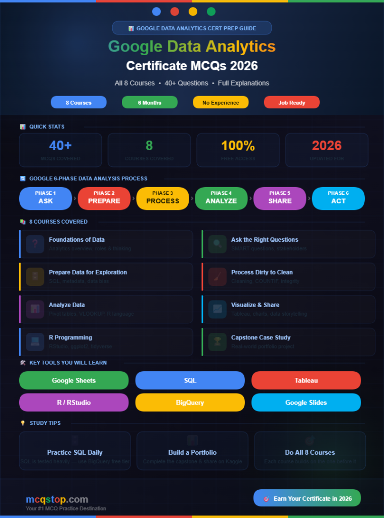
40+
MCQs Covered
8
Courses Covered
100%
Free Access
2026
Updated For
The Google Data Analytics Professional Certificate offered on Coursera is one of the most popular and impactful data certificates in the world — completed by over 2 million learners globally. It teaches the complete data analysis workflow from asking the right questions to collecting, cleaning, analyzing, and visualizing data using real-world tools including SQL, R, Tableau, and Google Spreadsheets. In 2026 data analytics is the fastest-growing job category — with an average entry-level salary of $65,000 to $85,000 in the United States alone. No prior experience is required. These fully solved MCQs cover all eight courses to help you ace every quiz and earn your Google certificate with confidence.
What data analytics is, data roles, analytical thinking, and the data analysis process
Question 01
What is data analytics?
AThe process of building software applications for businesses
BThe collection, transformation, and organization of data in order to draw conclusions, make predictions, and drive informed decision-making ✅
CThe process of designing databases for storing large amounts of information
DThe practice of writing code to automate repetitive business tasks
💡 ExplanationData analytics is the science of analyzing raw data to find trends, answer questions, and extract insights that help organizations make better decisions. It combines skills from statistics, programming, and business domain knowledge to turn data into actionable intelligence.
Question 02
What are the six phases of the Google data analysis process in order?
💡 ExplanationGoogle’s six-phase data analysis process is the backbone of this entire certificate program. Ask (define the problem), Prepare (collect data), Process (clean data), Analyze (find patterns), Share (visualize and present), Act (implement recommendations based on insights).
Question 03
What is the difference between quantitative data and qualitative data?
AQuantitative data is specific and measurable using numbers while qualitative data is descriptive and based on qualities that cannot easily be measured numerically ✅
BQuantitative data is collected from surveys while qualitative data comes from databases
CQualitative data is always more reliable and accurate than quantitative data
DThey are two names for the same type of data collected differently
💡 ExplanationQuantitative data answers “how many?” or “how much?” — like sales figures, temperatures, or age. Qualitative data answers “why?” or “what?” — like customer reviews, interview responses, or product descriptions. Strong analysts know when to use each type and how to combine them.
🔍
Course 2 — Ask Questions to Make Data-Driven Decisions
SMART questions, structured thinking, stakeholders, and problem types
Question 04
What does SMART stand for when creating effective data analysis questions?
💡 ExplanationSMART questions ensure your analysis stays focused and actionable. Specific (clear scope), Measurable (can be tracked with data), Action-oriented (leads to a decision), Relevant (matters to stakeholders), Time-bound (has a defined timeframe). Poor questions lead to poor analysis regardless of data quality.
Question 05
What is the difference between a stakeholder and a data analyst on a project?
AThey perform the same role on a data project but have different titles
BStakeholders are people who have an interest in the project’s outcome and use the insights while data analysts collect and analyze the data to generate those insights ✅
CA stakeholder always has more technical skills than a data analyst
DData analysts define project goals while stakeholders collect the raw data
💡 ExplanationUnderstanding stakeholder needs is a critical soft skill for data analysts. Stakeholders — such as executives, managers, or clients — define what success looks like and make decisions based on your analysis. Communicating with stakeholders clearly and managing their expectations is as important as the technical analysis itself.
🗄️
Course 3 — Prepare Data for Exploration
Data types, databases, SQL basics, metadata, and data bias
Question 06
What is metadata and why is it important in data analytics?
AA large dataset collected from social media platforms for analysis
BData that describes other data — such as when a file was created, who created it, its size, and what it contains — helping analysts understand and manage datasets ✅
CA type of data visualization used to display trends over time
DThe final summary report produced at the end of an analysis project
💡 ExplanationMetadata is “data about data.” For a photo file metadata includes the date taken, camera model, location, and file size. In databases metadata describes table structure, column names, data types, and relationships. Without good metadata analysts struggle to understand what their data means or how reliable it is.
Question 07
Which SQL clause is used to filter rows in a query based on a specific condition?
ASELECT
BFROM
CWHERE ✅
DORDER BY
💡 ExplanationThe basic SQL query structure is SELECT (choose columns) FROM (choose table) WHERE (filter rows) ORDER BY (sort results). The WHERE clause is how analysts narrow down results — for example WHERE country = ‘Kenya’ or WHERE sales > 10000. SQL is one of the most important tools in this certificate.
Question 08
What is sampling bias in data collection?
ACollecting data from too many sources at the same time
BWhen a sample is collected in a way that does not accurately represent the full population being studied — leading to skewed or misleading conclusions ✅
CUsing too small a sample size to save time during data collection
DCollecting data manually instead of using automated tools
💡 ExplanationExample: surveying customer satisfaction only via email excludes customers who do not check email — giving results biased toward email-savvy customers. Sampling bias undermines the validity of any analysis. Analysts must always question how data was collected and who was included or excluded.
🧹
Course 4 — Process Data from Dirty to Clean
Data cleaning, null values, duplicates, formatting, and data integrity
Question 09
What is “dirty data” in data analytics?
AData that was collected from unreliable or unofficial sources
BData that is incomplete, incorrect, inconsistent, outdated, or duplicated — making it unreliable for analysis without cleaning first ✅
CData stored in an unorganized folder structure on a computer
DData that has not yet been visualized in a chart or dashboard
💡 ExplanationDirty data is one of the biggest challenges in real-world analytics. Common issues include missing values (nulls), duplicate entries, spelling errors, inconsistent formatting (like dates stored as both “01/01/2026” and “January 1 2026”), and outliers caused by data entry errors. Cleaning data can take up to 60-80% of an analyst’s total project time.
Question 10
What does the COUNTIF function do in Google Sheets?
AAdds all numeric values in a range regardless of any condition
BCounts the number of cells in a range that meet a specific condition or criteria ✅
CChecks if a condition is true or false and returns a value for each case
DRemoves all duplicate rows from a selected data range automatically
💡 ExplanationCOUNTIF is heavily used in data cleaning. For example =COUNTIF(A:A,””) counts all empty cells in column A to find missing data. =COUNTIF(A:A,A2) helps identify duplicates. It is one of the most essential spreadsheet functions every data analyst must master.
📊
Course 5 — Analyze Data to Answer Questions
Aggregation, pivot tables, VLOOKUP, calculations, and data organization
Question 11
What is a pivot table and how is it used in data analysis?
AA type of bar chart that rotates automatically based on the data
BA data summarization tool that automatically sorts, counts, totals, or averages data stored in a spreadsheet and displays results in a new table ✅
CA database table that links two or more datasets together via a shared key
DA spreadsheet function that finds and replaces duplicate values automatically
💡 ExplanationPivot tables are one of the most powerful tools in a data analyst’s toolkit. They allow you to quickly summarize thousands of rows into meaningful groups — like total sales by region, average rating by product, or order count by month — with just a few clicks and no formulas required.
Question 12
What does VLOOKUP do in Google Sheets or Excel?
AVisually looks up and highlights a value in a spreadsheet with color
BSearches for a value in the first column of a range and returns a corresponding value from a specified column in the same row ✅
CChecks a range vertically for the largest value and returns its position
DCreates a vertical bar chart from a selected range of data values
💡 ExplanationVLOOKUP stands for Vertical Lookup. Example: =VLOOKUP(A2, ProductTable, 3, FALSE) searches column 1 of ProductTable for the value in A2 and returns whatever is in column 3 of the matching row. It is commonly used to merge data from two different tables — similar to a SQL JOIN.
📈
Course 6 — Share Data Through the Art of Visualization
Chart types, Tableau, data storytelling, and presentation skills
Question 13
Which chart type is most appropriate for showing a trend over time?
APie chart
BScatter plot
CLine chart ✅
DHistogram
💡 ExplanationLine charts are the best tool for showing continuous change over time — like monthly revenue growth or daily website traffic. Pie charts show proportional parts of a whole. Scatter plots show correlation between two variables. Histograms show distribution of a single variable. Choosing the wrong chart type is a common beginner mistake that misleads audiences.
Question 14
What is data storytelling?
AWriting fictional narratives using data characters and plot lines
BCommunicating the meaning behind data findings using a compelling narrative, visualizations, and context to engage an audience and inspire action ✅
CCreating animated videos that explain how data is collected and stored
DListing all data findings in a table without additional explanation
💡 ExplanationData storytelling bridges the gap between analysis and action. Even the most insightful analysis fails if it is not communicated effectively. Great data stories have three elements: data (evidence), narrative (context and explanation), and visuals (charts that make the data accessible and memorable to non-technical audiences.
Question 15
What is Tableau primarily used for in data analytics?
AWriting SQL queries to extract data from relational databases
BCreating interactive data visualizations and dashboards that allow users to explore data visually without needing to write code ✅
CCleaning and transforming raw data before loading it into a database
DBuilding machine learning models from structured business data
💡 ExplanationTableau is one of the world’s leading data visualization tools used by professionals across every industry. It connects to databases, spreadsheets, and cloud platforms — and lets analysts drag and drop fields to build sophisticated interactive dashboards in minutes without writing a single line of code.
Question 16
What is the R programming language primarily used for in data analytics?
ABuilding websites and mobile apps for data-driven businesses
BStatistical computing, data manipulation, and creating advanced data visualizations for analysis and reporting ✅
CManaging cloud infrastructure and deploying containerized applications
DWriting SQL stored procedures for enterprise database management
💡 ExplanationR is an open-source programming language designed specifically for statistical analysis and data visualization. In the Google Data Analytics certificate you learn R and RStudio — using packages like ggplot2 for visualization and tidyverse for data manipulation. R is widely used by data scientists and researchers globally.
🛠️ Key Tools in This Certificate
📊 Google Sheets
VLOOKUP, COUNTIF, pivot tables, cleaning
🗄️ SQL
SELECT, WHERE, JOIN, GROUP BY, ORDER BY
📈 Tableau
Interactive dashboards & data visualization
📉 R / RStudio
Statistical analysis & ggplot2 visualization
🔎 BigQuery
Google Cloud SQL for large datasets
📋 Google Slides
Presenting insights to stakeholders
💡 Top Tips to Complete Google Data Analytics Certificate in 2026
🗄️
Practice SQL Daily
SQL is the most important skill — practice on BigQuery or SQLiteOnline
📊
Build a Portfolio
Complete a real case study and share it on GitHub or Kaggle
🎯
Take All 8 Courses
Each course builds on the last — complete the full program in order
🎯 Keep Practicing — More MCQs Available!
We update our question bank regularly to match the latest course content
The certificate is available on Coursera and requires a paid subscription (approximately USD 49 per month). However Google regularly offers free access through Coursera Financial Aid, Google Career Certificate scholarships, and promotional periods. Many learners complete it within 3 to 6 months.
How long does the Google Data Analytics Certificate take?
Google estimates approximately 6 months at 10 hours per week. However motivated learners who study full-time can complete it in 3 months. The certificate consists of 8 courses covering data analysis tools, SQL, R, Tableau, and a final case study project.
Does the Google Data Analytics Certificate lead to jobs?
Yes. According to Google 75% of certificate graduates report a positive career outcome within 6 months. Google’s employer consortium — which includes companies like Walmart, Deloitte, and Infosys — actively recruits from certificate graduates. Entry-level data analyst roles typically start at $55,000 to $75,000 annually.
Do I need prior experience for the Google Data Analytics Certificate?
No prior data experience is required. The certificate is designed for complete beginners. Basic computer skills and familiarity with spreadsheets is helpful but not mandatory. All tools including SQL and R are taught from scratch within the program itself.
This website stores cookies on your computer. These cookies are used to provide a more personalized experience and to track your whereabouts around our website in compliance with the European General Data Protection Regulation. If you decide to to opt-out of any future tracking, a cookie will be setup in your browser to remember this choice for one year.


Leave a Comment